Grid Layout
The CSS Grid Layout Module offers a grid-based layout system, with rows and columns, making it easier to design web pages without having to use floats and positioning. -- w3schools
A grid layout consists of a parent element, with one or more child elements.
Grid Container
An HTML element becomes a grid container when its display property is set to grid or inline-grid.
.grid-container {
  display: grid;
}
grid-template-columns
The grid-template-columns property specifies the number (and the widths) of columns in a grid layout.
- The number of values determines the number of columns.
- The individual value determines the width of the column.
grid-template-columns: 20% 20% 20% 20% 20%; has 5 values which creates 5 columns, each set to 20% of the overall width of the parent.
grid-template-columns doesn't just accept values in percentages, but also length units like pixels and ems. You can even mix different units together.
grid-template-rows
This property is similar to grid-template-columns, except that grid-template-rows specifies the number (and the heights) of rows in a grid layout.
fr
Grid also introduces a new unit, the fractional fr. Each fr unit allocates one share of the available space. (Note: 1fr can take all the available space)
For example, if two elements are set to 1fr and 3fr respectively, the space is divided into 4 equal shares; the first element occupies 1/4 and the second element 3/4 of any leftover space.
The above code only creates two columns, because the number of values is 2 i.e. 1fr 3fr.
When columns are set with pixels, percentages, or ems, any other columns set with fr will occupy the space that's left over.
grid-template
grid-template is a shorthand property that combines grid-template-rows and grid-template-columns.
For example, grid-template: 50% 50% / 200px; will create a grid with two rows that are 50% each, and one column that is 200 pixels wide.
Grid Item
All direct children of the grid container automatically become grid items.
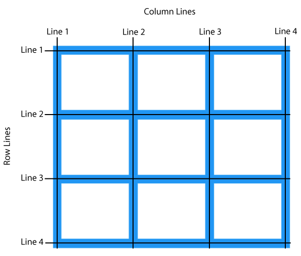
Grid Lines
- The lines between columns are called column lines.
- The lines between rows are called row lines.
grid-column-start grid-column-end
Specifies where to start/end the grid item.
#garden {
  display: grid;
  grid-template-columns: 20% 20% 20% 20% 20%;
  grid-template-rows: 20% 20% 20% 20% 20%;
}

#water {
  grid-column-start: 3;
  grid-column-end: 5;
}
grid-column-start: 3will place the water after the 3rd vertical grid line.grid-column-end: 5will place the water before the 5rd vertical grid line.- Overall, the water will starts after 3rd line and ends before 5rd line.
If you want to count grid lines from the right instead of the left, you can give grid-column-start and grid-column-end negative values. For example, you can set it to -1 to specify the first grid line from the right.
grid-column
grid-column is a shorthand property for the grid-column-start and the grid-column-end properties.
grid-column: 3 / 5 -> grid-column-start: 3 and grid-column-end: 5
Use span
Instead of defining a grid item based on the start and end positions of the grid lines,
you can define it based on your desired column width using the span keyword. Keep in mind that span only works with positive values.
grid-row-start grid-row-end
These two properties and the shorthand property grid-row work identically to its counterpart i.e. grid-row, except that these properties work on horizontal grid lines. see grid lines
grid-row
This property is similar to grid-column, except that grid-row works on horizontal grid lines. see grid lines
grid-area
grid-area is a shorthand for grid-column and grid-row and it accepts four values separated by slashes:
grid-row-startgrid-column-startgrid-row-endgrid-column-end
order
If grid items aren't explicitly placed with grid-area, grid-column, grid-row, etc., they are automatically placed according to their order in the source code.
We can override this using the order property, which is one of the advantages of grid over table-based layout.
By default, all grid items have an order of 0, but this can be set to any positive or negative value, similar to z-index.